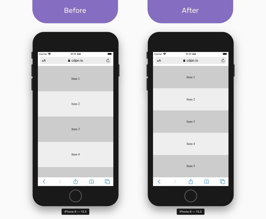
I don't know if you've noticed, but using the vertical viewport on mobile is shit. Here's a quick guide on how to make them less awful.
Look at the following picture and tell me where you think 100vh should be. Most of you probably said the green arrow, you know, the VISIBLE bit? Actually, 100vh goes all the way to the red arrow, why? I don't know, maybe because that little menu bar at the bottom is ever so slightly transparent that it counts as 'visible'?

Say you want a 100vh div, just to fill the space of the green arrow and nothing more, if you're on IOS, it's easy, just use webkit to fill the space:
.div {
  min-height: 100vh;
  /* fill on ios
  min-height: -webkit-fill-available;
}
But what if you're on Android? or if you need a more specific viewport size? No fear, I can help with that aswell!
First, get the value of the windows height, then take 1% of that. You can then set a CSS variable (I used —vh) using this value:
let vh = window.innerHeight * 0.01;
 document.documentElement.style.setProperty('--vh', `${vh}px`);
Then, it's as simple as multiplying your variable by how ever many units you want, for example, 50vh equivalent would be:
.div {
  height: calc(var(--vh, 1vh) * 50); // what vh you want
But Wait, There's More
If I were you, I'd add this nifty little resize event to change the value of your —vh variable, it will keep your sizing consistent, even when the window size changes.
Just wrap a resize event listener around where you set your variable:
window.addEventListener('resize', () => {
    let vh = window.innerHeight * 0.01;
    document.documentElement.style.setProperty('--vh', `${vh}px`);
  });
I use this whenever I need to set an elements vh, it's consitent across desktop and mobile, and a real time saver!
Previously published at https://torbet.co/posts/Mobile-Viewport-Guide

